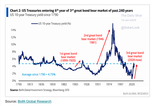
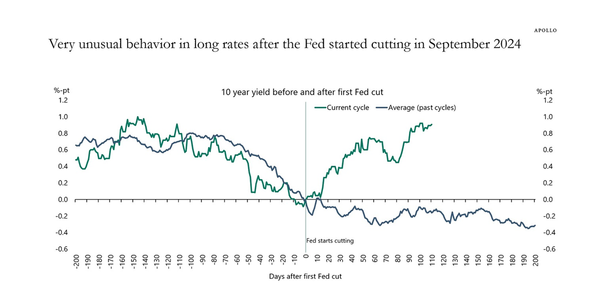
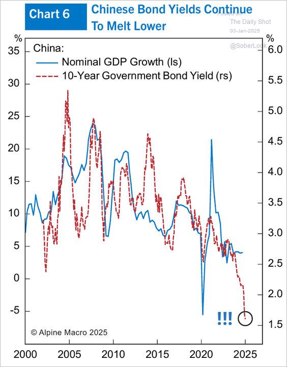
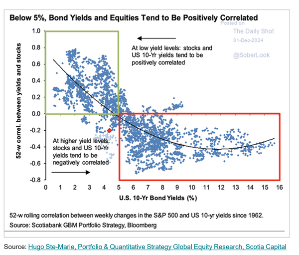
Nice chart .... I'd actually reframe it ... sub 4% yield correlation is almost always positive ... and its almost always negative above 6% .... between the two its not clear ... which suggests that market context (narrative) intrudes alot ... you will also note that once you get beyond a 6% bond yields